Friday, 18 December 2009

Evaluation

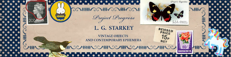
I originally stated in my learning agreement that I wanted to explore our relationships with objects, however reflecting on my final outcome I can see that the work has become much more about celebrating vintage publications and found printed ephemera. For my final piece I produced a wall covering. This was made from large sheets of painted paper incorporating materials such as found photographs, stamps, magazine and newspaper clippings. I was inspired by the work of Kurt Schwitters who believed in the ‘choice to montage every imaginable kind of commonplace object and waste product.’ I added coloured shapes to break up the areas of detail and add another point of interest and also worked in elements of screen prints I had done such as a polkadot print and an insert from an old Readers Digest that I developed into a repeat screenprinted pattern. This combination of elements helped to create the lively and fun aesthetic that I believe the outcome possesses.


I loved the intricately detailed designs on the hobbie pattern sheets so began tracing these and creating stencils from them. I enjoyed recontextualising found fragments creating a new context for them. To juxtapose the more complictated areas of collage I chose to have a more simplistic pattern spreading over a large area as well as a ‘candy striped’ element added to the composition.

I was very aware of my colour palette and decided to work using predominantly pastle tones to enhance the nostalgic vintage aesthetic that I wanted to create. I always planned to create an environment for people to be in that was a fun place to be and feel that I have achieved this however not on the scale I initially imagined.


I enjoy the fact that the audience are unable to take in the whole artwork in one go and have to look closer to see the smaller details and that you notice a different element each time you observe the work. I believe in a gallery environment this would draw the audience in and hold their interest for longer perhaps. Workng on a large scale has been a challenge I have enjoyed and to develop this way of working further in the final major project I would ideally create a permanent installation somewhere in the community. I think displayed in the right environment and professionally photographed would really bring an added quality to the work.


Within society there are certain conventions that we can all collectively understand however when viewing an image it is our own individual experiences and connotations that we bring to the piece that can make us respond in different ways. Barthes believed that text and image only become meaningful when observed by the viewer. Each person brings with them their own perceptions to the text and therefore we will all interpret a text in differently. Barthes describes text as:

"a galaxy of signifiers, not a structure of signifieds; it has no beginning; it is reversible; we gain access to it by several entrances, none of which can be authoritatively declared to be the main one; the codes it mobilizes extend as far as the eye can read, they are indeterminable...the systems of meaning can take over this absolutely plural text, but their number is never closed"


I have always been interested in this relationship between the author of an artwork and the reader and the way work can be interpreted differently by individuals. Therefore I wanted to leave the work as open as possible and I think I have achieved this. My work could be interpreted as a comment on and response to societies attitude on mass production and consumption.

Once I had completed the wallcovering I did intend to photograph objects in front of it, therefore combining 2D and 3D elements however I felt the objects distracted too much from the hand crafted work.However I did experiment with paperchains in front of the collage to give an added dimension. Overall I am pleased with my final images however feel I could have achieved a more resolved outcome if I had planned my time better and explored the topic more thoroughly.

more photos


photographs of final outcome, dont think they really do it justice!

Thursday, 17 December 2009

pauline barton wallcovering


initial compositions


Here i have been playing with compositions for the final piece. As you can see i have developed the hobbie patterns by creating stencils that will combine together with the more detailed collage, however I am mindful that I will only be able to see if the two compliment each other when I have finished the more detailed areas of the wallcovering. The stencils may not be included in the final outcome however I do enjoy their intricacy.

making shapes


These are the shapes that I have been developing and will appear on my final piece. I really like the bold colors and shapes and think they work really well visually and will be striking when they are blown up bigger.

painting paper


Have been painting paper as this will be the background for my collage, now all I have to do is fill them!Have been mindful of my colour choices as it is important that the grounds work together.

Thursday, 3 December 2009

playing with layout


These photographs show experimentation with composition. However i think these look too cluttered and will try and experiment with a more minimal aesthetic that is still detailed. Perhaps it is the mix of colours.

what to include


collecting objects and ephemera


Im not sure if I will use these objects in my final outcome however i wanted to include them to show what kind of objects i may use in front of the wallpaper. I photographed these and then tok out the back grounds using photoshop. I dont know if it would work to use them, lets just see what happens!

vintage hobbie patterns


I found these hobbie patterns in a local bookshop. They are exactly what I was after as they will work well with the overall look i want to create. Want to create quite a homely feel. I love some of the shapes that are created from the patterns and so I think I will stencil them to give added development and to re-present then in a new context.

pattern


this screen printed pattern was taken from an insert I found in an old readers digest. I developed the pattern by adding the polkadits to some of the shapes and blocking in one of the middles. After screenprinting the pattern, i had alot of copies so i experimented with ageing the papers by teastaining, bleaching and scouring away elements of it. I think this worked well.

Friday, 27 November 2009

Jiggery Pokery

Work by the creative duo jiggery pokery, a project inspired by South American coming of age parties where it is said that girls often dress to match their cake. A collaboration with Sarah Fotheringham.
This work appealed to me as it is similar to the type of aestheic i am trying to create with my work. Very detailed and fun installation. Quite lo-fi and quirky. lots to look and fun!
thats what i want my work to be!

Wednesday, 25 November 2009

paper chains


I have been creating paper chains to hang infront of my wallcovering to add to the combination of 2D and 3D elements and I think they add to the element of nostalgia that I want to create as paper chains have an association with school for many. I think these add to the aesthetic and create an appealing finish. I used found elements from the old fashioned newspapers I have collected and also colours that I have been playing around with.

Lene Toni Kjeld


Kjeld is a Danish designer that encourages clients to create their own wallpaper designs to decorate their home in a more individual way. The collection consists of 8 patterns, including 4 hybrids. By means of transition wallpaper, so called hybrids, it is possible to combine 2 different repeat patterns therefore creating different atmospheres. The patterns are unique and they can be combined. This combination creates decorative soft transitions. But more than being an elegant decoration the collection can be used functional to make space within space. This gives the possibility to create a more personal decoration.
The work focuses on way wallpaper defines a space and designs morph into each other from roses, to lace, to leaves. The use of layered patterning gives a historical sensibility 'shabby-chic', decollaged aesthetic and use of pastel palette.

Looking at Kjeld's work I see how it is possible to successfully combine different patterns and elements and how wallpaper can really change the feeling of a space. I admire the interchanging qualitites. With my own design I will try and keep the sense of playfullness and fun creating a space people will enjoy being in. I want the designs to be incredibly detailed so that the viewer looks at a different part everytime they view the work seeing it as a real celebration of vintage ephemera.

Animated wallpaper installation

Described as a 'pioneering digital designer/artist' Christopher Pearson's work explores the space between the virtual world of digital technology and the tangible tradition of craft. Pearson focuses on the potential of how things could be, as opposed to what they are. Working on bespoke projects he explores the lost art of craft. His work shows how far wallpaper has advanced in the past decade. Practioners in this area are really pushing the boundaries of what is considered 'wallpaper', none more so than Pearson. Like Verhoeven, his work adds a whole other dimension challenging the stereotypes between art and technology and our cliched views of wallpaper.
'Wallpaper became my own outlet for working with pattern, it also embodied my interests in traditional design and gave me a structure in which I could explore and find out what wallpaper could be, rather than what people think it is.'
'The problem with wallpaper is people think its just for walls; it should be an excuse to cover anything and everything.'


I agree with the quotes above from Pearson - and have tried when producing the work for this project to be open to ideas about what wallcovering is actually all about and means. I have been daunted by the scale of finished work i want to complete but I think i have to be positive and not daunted by it, anything is possible!

www.lookatyourwalls.com

Saturday, 21 November 2009

Beautiful losers

Have just watched the film 'beautiful losers' about a group of artists that came together and inadvertently created a new genre of art. The film really helped give me another perspective on my own practice.

The greatest cultural accomplishments in history have never been the result of the brainstorms of marketing men, corporate focus groups, or any homogenized methods; they have always happened organically. More often than not, these manifestations have been the result of a few like-minded people coming together to create something new and original for no other purpose than a common love of doing it. In the 1990s, a loose-knit group of American artists and creators, many just out of their teens, began their careers in just such a way. Influenced by the popular underground youth subcultures of the day, such as skateboarding, graffiti, street fashion and independent music, artists like Shepard Fairey, Mark Gonzales, Spike Jonze, Margaret Kilgallen, Mike Mills, Barry McGee, Phil Frost, Chris Johanson, Harmony Korine, and Ed Templeton began to create art that reflected the lifestyles they led. Many had no formal training and almost no conception of the inner workings of the art world. They learned their crafts through practice, trial and error, and good old-fashioned innovation. Not since the Beat Generation have we seen a group of creative individuals with such a unified aesthetic sense and varied cultural facets. The world of art has been greatly affected by their accomplishments as have the worlds of fashion, music, literature, film, and, ironically, athletics. Over the years, the group has matured, and many have become more establishment-oriented; but no matter, their independent spirit has remained steadfast. The story of the Beautiful Losers will be a retrospective celebration of this spirit.

Sunday, 15 November 2009

Saw this stencil near bricklane in London which contains a repeat pattern that is prevalent in traditonal wallpaper design. It got me thinking about displaying my work in a public space or photographing the final outcome and then displaying that.

Tuesday, 10 November 2009

PRINTERESTING

http://www.jenblazina.com
I came across Blazina's work when researching on the printeresting website. Her work revolves predominantly around found objects so naturally I was intrigued as my project has this theme. The following is an interview I found with her.

Her piece, titled
Refused, consists cast hydrocal frames with lithographic images printed on satin. The work is made up of thousands of variations of these little tromp l’oeil victorian mementos. The show consists of strong examples of contemporary craft and art. All the work seems to trouble the definition of the term craft: deconstructing the function of furniture and ornament, slip-casting crazy ceramic multiples, taxidermy gone artsy, and generally all kinds of great objects.
Can you say a few words about your studio practice?

While searching for discarded objects from thrift stores, on the street, and ones passed down to me from my family, these become personal
keepsakes, icons of the past which otherwise would be overlooked or regarded as something useless. Based on this experience, collections represent a sense of holding onto a place in time. By re-creating these objects through casting and re-fabrication, I have used the history of the objects in my own current tense.

My installations examine commonplace objects and subtle images, which evoke a haunting and
ephemeral sense of a familiarity with the past. The photographs and selected objects become iconic themselves and allude to the tangible evidence of the invisible portal to a moment and the temperamental narratives, evoked by both the image, and memory.

I can really relate to what she is saying about her work and feel that I am trying to achieve similar objectives in my own practice. I am examining and using found imagery and re-contextualising it to evoke in the audience a sense of nostalgia and re-appreciation. - connecting people with objects.

Stencil experiments

these are a couple of screenprints that I have produced on my evening course. They were created by using a simple cut out stencil technique. i like them however I think they are too obviously like traditional wallpaper designs and I am aware that I have to move away from this aesthetic. Could do so much better, more original.

Julie Verhoeven


Inspired by French 18th century Toile de Jouy wallpaper, creative director Peter Saville commissioned illustrator Julie Verhoeven to create ‘wallpaper for the computer’. Saville supplied Verhoeven with reference imagery of Japanese rope suspension bondage to introduce an element of erotic danger; a counterbalance to the delicate detail of the historical textile source. Verhoeven produced a sequence of virtuoso, linear vignettes growing increasingly expressive in execution. The interactive sequence can be seen in the exhibition, a labyrinthine route through the drawings.

This commission is interesting in that is was designed specifically for computer, a sign of our postmodern digital age. This work links directly to Baudrillards theories of loss of reality in society and how as a society we have become subsumed by layers of simulacra.

This is something I have mindful of throughout the unit.

Marcus Oakley talk


Have just got back from uni where Marcus Oakley http://marcusoakley.com gave us a lecture about his work which was beneficial to me. His presentation really helped me to put my work in perspective and realise that if you have a passion for something like he does then you should explore it, no idea or thought is too stupid or mundane which I find is a big worry for me when producing my work. He talked about his influences and likes and dislikes and clearly has a very distinctive style. He talked about different types of his work like abstract decoration and how a skecthbook is a visual diary and about his idea of visual culture and what that meant to him - a building, clothing etc can all be integrated into art.

Notes of interest from lecture - He thinks he gets paid to draw badly He has a cup of tea and cycles around to get inspired - how do I get inspired? abstract work - he likes the physicality of making, a journey -he used the word Colourama?? 2D work - creates a structure and melody that cascades into something. Commissioned work is a watered down version of what you do.

Wednesday, 4 November 2009

Tutorial with David Callow

David Callow was really positive about my work and gave me some useful advice that helped clarify my ideas and the direction of my work.
He said just to really push the experimentation and techniques I used and suggested things like screen printing straight on the wall which I might consider and said that my work had a kitsch quality to it which I enjoyed although I did look up the definition of kitsch and it seems to have quite negative, whimsical connotations. He also inspired me to create my own patterns and layer up my images with a combination of elements, details, patterns and colours. When I mentioned about finding a space to exhibit he said he thought I should make the space somewhere 'really nice to be in'. I know matt had previously mentioned to me that he thinks using royal memerobillia was too twee but I'm still worrying about the rate and progression of my work so I think if I play around with displaying and integrating objects such as these then this will ulitmately lead me somewhere.

Monday, 2 November 2009

Collage

This is a very initial collage piece that I did on my bedroom wall. I felt like I had to start making something however this way of working doesnt seem to relate so well to what I am trying to achieve which is re-presenting objects!I want to use much bigger cut out and stenciled sheets of paper, building up this organic working collage. I was to encorporate all the elements I enjoy and will experiment with composition and colour as I go. I have found some dress making pattern sheets so want to try and create work on this larger surface trying out scales.

Tuesday, 27 October 2009

mixing colour do do be do

In my learning agreement I said I wanted to make a conscious effort to be more considerate about my colour choices, im really liking pastle colours at the moment...

trip


The London trip was enjoyable and a chance to view a variety of exhibitions and the way they were curated with our end of year exhibition in mind. I went to the two tates, the Haywood Gallery, had a dodgy chicken tikka baguette on Southbank and then went to the Museum of Everything. This was by far the most worthwhile exhibition I saw -the building was full of charm and the layout was really well thoughtout with lots of knooks and crannys to explore. Very quirky and refreshing to see an exhibiton that breaks away from conventions by representing outsider and self-taught artists. I enjoyed seeing the collages of Henry Darger and especially liked drinking tea from the missed matched cups and saucers in the shop at the end!

Francesco Simeti

'Arabian Nights' (2003)

Francesco Simeti’s appropriates and digitally modifies newspaper and magazine clippings from war scenes and other violent acts and re-arranges them in repetitive sequences to create images with a deliberately decorative element, that conceal an alarming sub-text. In this way, he comments on the aestheticisation of violence but also on the way in which the media often reduce horrific events to trivial episodes. Simeti is concerned with the way we consume images and information through the media but also the way that media information has different meanings or repercussions for different groups of people.

'Wallpaper is a perfect grid for me to organise and make sense of my archive of media clippings and it allows me to create hidden narratives.'

What I can appreciate and take from Simeti's work is his clever way of combining found imagery with a traditional aesthetic and technique. The wall paper is not purely decorative but driven by its comtemporary content.

Saturday, 24 October 2009

Warhol wallpaper

Andy Warhol's Cow Wallpaper (1966) Bold, screenprinted cow motif has become an iconic work of Warhols. Saw this work in the Tate Modern. Warhol is known for producing work that draws directly from contemporary American culture that show how objects can be taken out of context and re-presented as an artform such as his painting of the Campbells soup can, Warhol is directly confronting the issue of what is art?and asking the audience to reassess their idea too.

Thursday, 22 October 2009

Hand printed wallpaper


Deborah Bowness been designing and producing hand printed wallpapers for 7 years. Her work has a playful sophistication that combines wallpaper panels with photographs of things like clothing, shoes, mirrors and frames.